 28 April
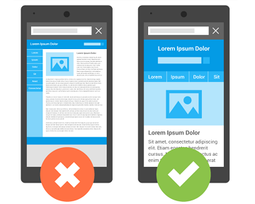
With the introduction of smartphones, people have been using them for various purposes. The widening of the reach of the internet has made it possible for people to use the smartphone anywhere they wish. This means that they don't have to be tied to a laptop or desktop to browse the net. They can browse the net for their requirements anywhere using their mobile phones. The problem with mobile devices is that they come in different sizes and resolutions.
This poses a huge challenge for web designers as the websites that look good in one device appear differently in other devices. Websites meant for larger screens could be only partly visible on smaller devices. The problem with this is that companies with websites good for one platform can only gain customers using that device or platform. There must be a way out of this problem. This is where a responsive design helps.
Understanding Responsive Web Design
The use of responsive web design techniques makes a website give the same user experience in different screen sizes. It means that the website responds to the users’ behavior with regard to screen size, platform, and orientation of the screen. The website will look and feel the same irrespective of what device you use or how you hold the device. In a mobile phone where the screen rotates as you turn the device, the website will also change according to the orientation. Even preference like VPN must be considered and ensured that the user is not denied access to any page of the website.
This would mean that if you are switching from the laptop to a mobile phone, you will get the same experience on the website. This has a lot of advantages for e-commerce companies. The user will select the products on the laptop where they can see the products in a larger size. The actual purchase may be done on a mobile phone while they travel from home to the office or back. The customer must be able to continue the purchase process without any difference in user experience.
Better Mobile Traffic and Lower Maintenance
The main benefit of a responsive design website is the huge increase in mobile traffic. You can capture a huge chunk of the audience that uses only mobile phones for all their needs. The millennials are considered to be the ones who do online purchases a lot. This market segment prefers to use the smartphone for all their purchases and you will lose out on this chunk unless you have a responsive website. You will be catering to the market that will purchase products online.
As you know more and more people are using the mobile app because it is easy to use on smaller devices. But building a mobile app is very expensive and takes a long time. if you are developing a responsive website, it can act as an alternative to the mobile app, while saving you much money in development costs. It is also faster and you are available on the smaller devices earlier to capture as much of the market as possible.
Though building the best responsive websites is costlier than building two separate websites for your desktop and mobile, the maintenance cost is much lesser. It will also require additional testing and support. When you build a responsive website the testing method is standardized to ensure that the layout is good on every screen. Moreover, when you have two different websites for desktop and mobile, you will need to have two content strategies, an administrative interface, and two different design teams. Designing a website that fits all sizes also means a lesser headache for the developers.
Better User Experience with Responsive Design
Having a responsive web design also means a better user experience for your customers. The aim of any company in spending money on developing a website is to give the users the best experience on the site and converting them into customers. Users nowadays are not patient. It has been found that users leave the site if it doesn’t load fully within three seconds. A site that is optimized for use in the small screens allows the user to navigate the site quickly, preventing him or her from leaving the site. This increases your chances of converting the user.
When the user gets a better experience with your website, he or she is likely to stay there and explore more pages. This helps to spread awareness about your brand. It also increases the chance of the visitor taking the purchase decision immediately. Building a responsive web design in Singapore ensures lower bounce rates that will automatically result in more conversions. This means that your ROI on the investment is much higher.